Is your website mobile ready?

Are you Mobile Ready?

Mobile devices are changing the way we exist. Many people would be bereft without their mobile as a source of information, entertainment and as a means of communication.

So much so that mobile access to the Internet has overtaken and now far exceeds larger devices such as laptop and desktop computers.  In a recent study commissioned by Google, 69% of smartphone users said they turned to mobile search in a moment of need.

2 years ago, Google announced they would be prioritising sites in the search results that were mobile friendly over those that were not. This continues today.  If your web site is not mobile friendly, then you are potentially needlessly giving away postions in the search results.

So how do you know if your site is mobile friendly?

Simple.  Google have produce a tool that will tell you instantly if your site is mobile compatible.

search console tool, mobile friendly
Google Search Console, mobile friendly checker

Put your website URL into the search box, click Run Test and see for yourself if Google recognises your site as mobile friendly.  If it is, then you will see a page something like the one below.  If it is not then you will get a series of warning and advice on what you need to do to make your site mobile friendly.

QD Design site successfully passing the search console mobile friendly test
This is how your site should look…

“But”, I hear you yell, “Most, if not all, of my visitors are using desktop / laptop computers, so it doesn’t matter to me, does it”.   Wrong.   Google will still penalise your site if it isn’t mobile friendly even though no mobile users currently visit it.

Can you really afford to needlessly give away search engine position because your site isn’t compatible with mobile devices?

QD Design only design fully responsive mobile friendly web sites that ensure you are not penalised by Google or the other search engines. If your web site is in need of a “tune up”, let’s talk.

WordPress – How to Change the Number of Dashboard Columns

This has been bugging me for weeks.

I tend to use a single decent sized monitor for most of my web design work.  On it, every WordPress install gives me two columns of very large dashboard blocks that makes appallingly poor use of the available space.  So much so that with a number blocks expanded to their full size, much of the information is off the bottom of the screen meaning I have to scroll down for it.  Sort of negates the idea of a ‘dashboard’ if you have to go looking for the info.

I do have one site that for some reason has three columns and it made much better use of the available space.  I wanted to recreate this on my other installs but couldn’t find out how.  I searched every control in the menu structure, looked at the code that drove the dashboard but nothing came up.  How on earth did this one site have three columns and not two?


Prior to WordPress 3.8 there was an option to choose the number of columns present in the dashboard but 3.8 saw this disappear.  Admittedly, there are plug ins that allow you to take control over the dashboard but I’ve discovered something easier, simpler and so obvious I’ve been kicking myself since I found it.

Most browsers allow you to zoom in / out.  On my personal favourite browser – Chrome (and I’m pretty sure it is the same in others too), it is CTRL + / CTRL –
Well, if you zoom out to 90%, such a small change in font size you will barely notice it, it gives just enough room to fit three columns across the dashboard. Voila, everything in view, all at the same time and no need to scroll.

Give it a try. If you have a reasonable amount of space on screen when working on a WordPress site, why not make the best use of it.

What Facebook knows about you

What Facebook Knows About You

The recent BBC Panorama programme on “What Facebook Knows About You” seems to have taken many people by surprise.  If you are active on Facebook and the Web, you are leaving a ‘digital breadcrumb’ trail behind you.  Every ‘like’ you make, every post you share, every place you check into in Facebook, all gets logged and used to create a profile about you.  This profile is used to serve up adverts to your Facebook page that best fit your interests and lifestyle.   This is the price we pay to use this “free” service.

Many of the people featured in the programme last night were surprised at what Facebook knew about them and what Facebook perceived as their interests, hobbies and preferences.

You can easily see what Facebook knows about you.  And, if it is not to your liking, make some changes to it.  Here’s how…..

1. Assuming you are on a computer rather than mobile device, in Facebook go to the little down arrow on the far right of the blue bar at the top of the screen (next to the question mark that goes to the help info).  On a mobile go to the three horizontal lines and scroll down to Adverts.

How to find out what information Facebook holds on you

2. Choose settings from the drop down list

3. From the list on the left hand side, choose Adverts. You might also want to try the Download a copy of your Information though this can be pretty vast if you are a prolific poster. This gives you a zip file on your computer of everything you have ever posted on Facebook (text, images, videos) as well as any events you have attended or shown an interest in.

4. From the Adverts link you will see the following. Each of the rows – Your Interests, Adverts You Have Interacted With can be expanded to show more information. This is what Facebook uses to build your profile. Most of it shouldn’t be a surprise as it is you that caused it to be logged.

However there may be the odd anomaly that you can’t explain. No, I’ve no idea why I ‘Entre Rios Province’ is listed as a place I am interested in either!

5. Every one of these snippets of information can be edited and removed. The X button will remove it from your list of places, list of hobbies, list of advertisers with who you have interacted.

One important point to note is that you are never going to get rid of Facebook Ads entirely. That is what keeps it free to use.

Advert settings in Facebook

However, using these tools you can fine tune the ads you see so that embarrassing one for ‘ointment’ doesn’t appear.  If you turn off the Interest Based Adverts feature completely, then you will see any old advert that Facebook deems to put in front of you.  Leaving it on means there is a chance the Ads you see ‘might’ be relevant to you.

If you don’t like what Facebook knows about you, then the choice is simple. Delete your Facebook account, stop using the web on any device, sell your house, buy a tent, move to the woods and hide. OK, this last advice is purely tongue in cheek, you don’t necessarily need to buy a tent, you might be lucky and find a cave to sleep in!

Seriously, should you worry about the information Facebook knows about you?   Probably not.  Between Facebook, Google, your Internet Service Provider and your mobile provider, there is little these people don’t know about you.  Add in your local supermarket where you use a loyalty card, other websites where you check in or use a service e.g. your fitness tracker, and almost your entire waking day is logged or mapped.  If you are doing nothing you are ashamed of or nothing that you shouldn’t be doing, then you have little to worry about!

How long to set up a shop and sell online?

How long does it take to set up a shop and sell online?

I’ve been asked this question several times in the last week.  When you turn it around and ask the questioner how long they reckon it will take, the answer is usually several hours, if not days.

What if it took less than 30 minutes to set up your own shop and begin selling on line, wouldn’t you do it?  Of course you would!

You design handmade jewelry, knit incredible garments, print custom T shirts or make amazing items of artwork and sell them to friends / family and through local independent shops.

No doubt your customers are delighted with your products and tell all their friends about you. But you are still only tapping into the tiniest proportion of your available market. Unless someone happens to know you / one of your friends or be in that independent shop, they have no chance of knowing about your product and thus making a purchase.

The answer (of course), is to sell online.  However, several conversations in just the last week show that for many people the idea of setting up their own shop is a daunting one, and one they expect to be complex and problematical.

Let me let you into a secret. It isn’t! You could easily have a shop of your own up and running in around 30 minutes.    Here’s how.

1. Assuming you have a website running WordPress, install the WooCommerce plug in. WooCommerce is part of the organisation that builds WordPress itself and it is the biggest (by a long way) e-commerce platform on WordPress.   Not got a WordPress website – no problem. Just about every server can handle WordPress*, it is easy to set up a simple WordPress site, styled to look like your current website and put links to it from the relevant places in your main site.

2. Configure WooCommerce – set up your location, currency, whether it is a physical or downloadable product (e.g. an e book), customise any email confirmations you want the system to send.

3. Download the Payment Gateway plug in of your choice (PayPal, Stripe, Amazon Pay, WorldPay etc) and configure your account.

4. Connect WooCommerce to your chosen payment gateway and link using the provided API key.

5. Create a product to sell in WooCommerce. Ideally with a product description, images, size / colour options etc.

6. Begin selling!

It is as simple as that.  In 30 minutes or so, your reach will have gone from local to potentially global.  What’s stopping you?   You have a great product, why not sell it as widely as possible!

At QD Design we can assist you through the process. From simple advice and guidance, to setting up the WooCommerce platform and Payment Gateway or even building the complete WordPress site to contain it all.

We eat, sleep and breath the web and want to help businesses make the most out of it. Call us for a chat or drop us an email and we will get back to you.


*If your server really can’t support WordPress, we need to talk, urgently!  You are being hosted on a device that may well be compromising your websites speed and thus your position in Google search results (Google hates slow sites and penalises them over faster ones).

Scam Alert! Domain SEO Services

If you own or manage a domain you need to read this.

I manage quite a few domains and, as such, see a fair number of domain communications each month.  One recent e mail stood out.  There was something about it that wasn’t quite right.

  1. It had no letter head or logo and the sender was not who I have my domains registered with.  In fact the layout and style of the message is deliberately ‘vanilla’.
  2. Whilst this domain is up for renewal this year, I knew it was in October and not the Spring when the renewal was due.
  3. The wording was both very lengthy and hard to understand.  Again a deliberate ploy to confuse anyone that receives such a mail that it really needs to be acted upon.
  4. The incentive to “Buy Now” seemed just a bit too forceful and smacked of a con.

So what is it?

Well it isn’t a domain renewal notice even though it has a domain name, a duration of service and even a start date.  It is an offer to buy “Domain SEO Service” and  “to purchase a search engine traffic generator”.

No clear details are given on what these products will do for your website.  The one thing that is clear is that Google takes an incredibly dim view of attempts to artificially increase a sites ranking in the search results.  So much so, that sites have been penalised and in some cases banned when it has been discovered they have tried to manipulate the Google search results.

It is not worth the risk.

You do not need to pay to have your domain name submitted to and indexed by the search engines.  This could be the worst $75 you might ever spend.

You DO need to engage someone to help you optimse the content of your site and effectively focus it around your chosen keyword(s).  Your web designer should be able to advise on how best to go about doing this.

This Domain SEO Service Expiration Notice is a very clever and cynical scam.  It deliberately creates a sense of apparent urgency around the renewal of a service and hopes that the recipient either is in too much of a hurry to read it or not knowledgeable enough to know that it is unnecessary.  The originators know that in many small and medium sized businesses, the staff are working flat out and spending 5 – 10 minutes trying to work out whether something is genuine, is time they simply do not have.

If / when you get your domain renewal notice in the mail, or something that looks like one; read it very carefully before acting upon it.  It may not be quite what it seems.

iTunes GRRRRR

Podcasts are a great way to make use of time that would otherwise be wasted spent commuting, exercising or doing mundane chores. In another post I’ll share some of my favourite podcasts but one thing seems common to most of them…..

The presenters frequently ask listeners to go to iTunes to like and subscribe to their podcast. I understand this can raise the profile of a podcast meaning it has a better chance of getting even more subscribers. However, as an Android user I have no intention of going anywhere near iTunes for any reason, ever.  In fact, when I hear this it just shows how lacking in awareness the podcast presenter / producer is and how blinkered they are to think that every listener will be using an Apple device.

I’ll personally buy a beer for the first podcaster I hear acknowledge the fact that you can access and subscribe to podcasts through other means besides iTunes.

Sharp Practices by Web Designers

Recently, I noticed in my Facebook feed the name of a local web designer that was new to me.  Being curious and wanting to keep abreast of the competition, I looked them up.  I was disappointed to discover they had adopted a number of tactics that were clearly pushing the boundaries of what could be described as honest.

It got me thinking, I am the only web designer that is entirely truthful on my site and in my marketing?

So, what was this new entrant doing that was misleading and potentially dishonest?

Their Facebook ad looked like this…

Taken at face value (as many potential customers will do), this is  an unbelievable bargain.  Even outsourcing to the cheapest and least skilled offshore supplier imaginable, there is no way a ‘professional’ website could be created for £49.  And of course, it isn’t true.  Following the link to their website reveals that the real cost is £49 per month (oh and on top of that there is an ‘initial set up’ fee of £199 as well).

Assuming the business maintains the website for five years, it will have really cost an eye watering £3139 before any VAT / sales tax has been added.

Secondly, the business in question had a glowing testimonial from a garage owner who seemed delighted with the service provided.  It sounds as if the new website had already born fruit and was bringing in new business.  Oddly, there was no link to the site in question which seemed peculiar given the situation.  Stranger still, a search on Google for Prestfield Motors returned no matches whatsoever.  In fact, there were no matches for Kenny Sinclair and the motor trade in Edinburgh.  Zero, nil, zilch, zip.

It was a fake testimonial from a fake business alleging benefits that were utterly fake.  It got me wondering who was in the picture, was this really Kenny Sinclair or was he a fake too?

Of course he was a fake!  Using the ever so handy Google Reverse Image Search facility revealed that ‘Kenny’ is a prolific chap.   He appears on a hair loss website in South Africa, an Arizona skin clinic site, a UK house sale site as well as countless social media sites.‘So what’ I hear you say, don’t we all embellish the truth a bit?  Well, yes and no.  It depends on how far you take the embellishment.  In this case, the deliberate attempt to mislead on pricing is pretty close to the widely discredited and highly disliked technique of “bait and switch“.  The use of a stock image in a testimonial whilst you are awaiting a photo from the customer is understandable but deliberately creating a fake identity, a fake business and a whole fake story to sell your services is downright dishonest.  As soon as a potential customer realises your claims are unfounded they should begin to question everything you say.

For example, is your support as good as you claim?  Is your uptime really as high as you indicate?  Are you truly based in the local area or are you a front for a “pile it high, sell it cheap” offshore operation?

It is all about credibility.  Most customers do not want to do business with a firm that feels it is OK to deliberately mislead and be dishonest on their website.  Why would you trust a firm that did this?  After all, if they do this on their own site, there is a good chance they could do it on yours too.

Whatever your line of business, think carefully before making unclear, misleading or entirely false claims on your website.  The consequences will inevitably come back to bite you.

Seasons Greetings

Seasons greetings from QD Design

Merry Christmas & Happy New Year

Christmas is a wonderful time to take a break from the rush of work and
rejuvenate for the year ahead.
Hope you are able to enjoy time with family and friends. Sending you best wishes for 2017.
Thank you to all our customers, past, present and future.  We hugely appreciate working with you.
 
QD Design will be closed December 24 to January 4
and will return the first Wednesday of 2017.*
*For urgent issues or emergencies, please call or text.

Why DIY websites frequently fail to deliver

Pitfalls of DIY web Design

Recently I participated in a Marketing Seminar at the Business Gateway in Aberdeen, facilitated by the excellent Liz Pirrie.  Listening to the great bunch of people passionately describing their businesses – animal welfare, fitness trainers, payroll services, pollution control consultants, luxury soap manufacturer, the variety was huge – and their hectic days; it was obvious that as a small business owner you have many, often competing, priorities ….

  • Sourcing and managing suppliers
  • Fulfilling customer orders
  • Client / customer communications
  • Product / service development
  • Filing accounts
  • Forward planning and scheduling
  • Updating details in the customer database / CRM
  • Market research
  • IT “housekeeping”
  • Networking
  • Exercise and health
  • Time for family and friends

I was exhausted just listening to them!  It got me thinking, ‘why, when you have so much on your plate already, would you ever would ever consider making your own website’?

It is true, if you require a website for your business, you are faced with a bewildering range of choices.  ‘Doing it yourself’ using one of the apparently “easy to use” template based services can be very appealing.

However, is it such a good idea?  Are there any drawbacks to using a template driven site builder for your businesses website?  Yes there are, and before opting for a DIY template website, here are seven you should be aware of before opting for DIY.

 1.  Learning Curve – The adverts for these services are full of people smiling happily whilst they create an amazing looking website in less time than it takes to rustle up a sandwich. It is largely a con.  As with any tool, working out how to use it, and use it effectively, takes time.  Business owners can often take 40 – 50 hours to learn how to use the web development tool and then craft the finished website for their firm.  Whilst the business owner has been beavering away creating a website, what else could (perhaps more importantly – should) they have been doing?  And, have they truly saved any money by doing it themselves?  Take those 40 -50 hours and multiply by the hourly rate charged to a customer.  They may well find that a professional web designer would have cost them less (and created the site far more quickly) than the business owner has managed to do themselves using a template.time flies

2.  No differentiation – Using a template means that everyone that adopts that tool starts out with the same basic framework. More than likely, the resulting website will resemble each other.  Access to the same font packages, same image galleries and same basic colour schemes all but guarantee a site is going to be similar to other sites derived from the same source.  We all want to stand out, we all want our business to look different; using a template significantly reduces our ability to reflect our businesses true identity in our website.

sheep
Don’t be a sheep and use a template, employ a web designer instead!

3.  User Experience – Whilst a template does allow you to create a website, will it be a good website and will it work for your customers? Most of us make a snap decisions about a product or service in the first few seconds of viewing its website.  Without a good understanding of User Experience (UX) and thus User Interface (UI) design, the business owner employing a template is stuck with the UI and UX that the template builder had in mind.  Poorly placed navigation links, hard to read colour combinations, unresponsive designs will all drive the site visitor back to the search results and onto another site – another potential customer lost.

 4.  Transfer-ability – In many cases, you can’t easily move a site or its contents when it is based on a template service. If the business happens to outgrow the service provided by the template hosts or gets fed up with their less than stellar support, they might discover they are stuck with the template hosts as they are not be able to download their content to go elsewhere.  They are not far short of being a “hostage”!Hostage to the template

5.  Backups – Most templates back up their systems in case of a crash but don’t necessarily protect you from yourself. If you accidentally delete an entire page from your website it may be gone for good.  As an aside, if a site is created in a template it is worth backing it up to your local machine so you have the text and images just in case you remove something important.  Imagine how long it would take to restore an entire page of information, source the graphics you previously used and re-configure the links you had on the page.

6.  Total cost – The template will cost more in the long run. Most templates are based on a monthly fee.  This can be upwards of $25 / £18 per month.  Add that up over a couple of years and compare to site hosting fees.  Over the course of a few years the small business will have spent more than it would have taken to have their site built by a web designer and have it hosted.templates cost you more

7.  Lastly, Value versus Cost – Yes, going down the template route might appear to be cheaper (though you might be questioning this now too) but will the website give the business the Value it needs and requires?  A good website will help to draw customers to a business whilst a poor one might actively turn them away.  Small businesses usually have a very specific goal in mind for their websites.  Attract, engage, retain and convert visitors to customers.  If a site fails at any one of these stages then it clearly hasn’t succeeded as a business tool.  Knowing how to attract, engage, retain and convert visitors is what you are paying the web designer for.

Do your business a favour and don’t trust to luck and a template.  Engage a web design professional to make your business website a success.  It will let you get on with successfully managing your business!

QD Design have been making outstanding websites for smaller businesses and start-ups since 2004.  We know exactly the challenges small business face and can help and advise on the best options for any small business looking to get onto the web.

14 Ways to Increase Website Traffic

The prime purpose of virtually every website is to be a “shop window” to the world.  Most businesses I speak with want to significantly increase the traffic to their web site.  And, once there, they want to covert more of that traffic to active, loyal and long standing customers.  Your “shop window” may be fantastic but if no one stops by to view it, it isn’t doing much for your business.increase-traffic

Here are 14 ways to get more traffic to your site and to convert that traffic more frequently.

1) Easy navigation
Around each page, between pages and back to the home page from any level within the site.  When visitors get lost or confused on a site, they typically go to elsewhere.  The navigation should be obvious and readily accessible from every page on the site.compass-nav

2) Responsive design
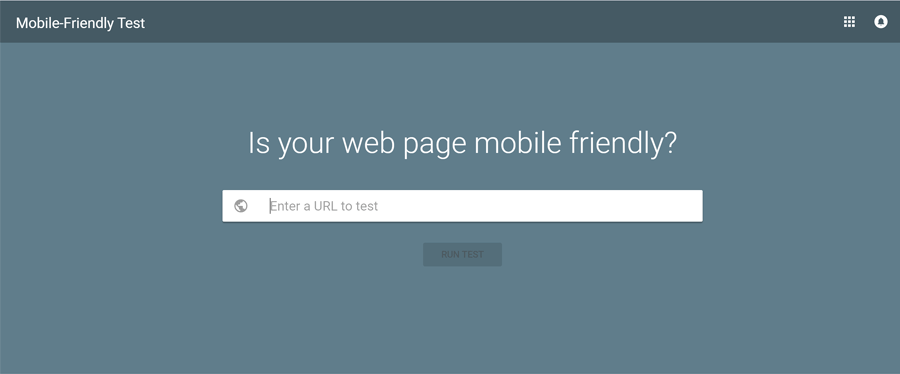
Yes, I know this is nothing new but if the visitor on a phone cannot view the site, they will vote with the back button and go elsewhere.  Ensure that everyone, regardless of device, can see your site as you want them to.

3) Compatible and tested with multiple browsers
Whilst you no doubt have a favourite browser, your visitor may use an entirely different platform.  Does your site work equally well in ALL browsers? Did you check this?

4) Page speed
No one likes to wait.  People drift away if the page is slow to load and rarely return to a slow site if they can help it.  There are many tools you can use to evaluate page speed and make improvements to a site  Google Developers Page Speed Test is one we at QD Design use frequently.speedo

5) Dead or broken links
Nothing says “unloved” website more than a broken or dead link.  It is a real turn off for visitors.  Either check your links by hand or use an on line link checker such as Broken Link Check to see if there are any that need updating.

6) Testimonials
Genuine testimonials from real clients can count hugely to converting visitors into customers.  If appropriate, include a video from them talking about your product or service.  This is just about the most powerful advocacy you can get for your business.

7) User interface / user experience
A website has to meet the needs of the visitor / customer and not pander to the whims and desires of the site owner and designer.  A site that is easy to read, easy to navigate and free from irritating distractions will convert many more visitors.  For additional advice on UI / UX, check out this great info from the guys at UX Myths

8) Language appropriate for your audience
Write in their language; avoid jargon, slang and any colloquial phrases that people may not understand.  Always bear in mind that your website is a tool for the visitors and not a vehicle for you to show off.dictionary

9) Answer visitors questions
In other words, try to predict what questions brought them to your site and what information will satisfy them.  If you don’t know, then you may have missed something vital to help convert visitors to loyal customers.

10) About us
Few people want to do business with someone / something they don’t know.  Ensure your site has an ‘About Us’ section that says who you are and what makes you tick. Present your human face to your visitors (you are human aren’t you)!

11) Pricing
Similar to the ‘About Us’ point above, visitors rarely feel comfortable doing business with a firm where the prices are hidden or unclear.  If you can, show your pricing structure openly so it saves any embarrassing moments when the customer realises they cannot afford you / your services.

12) Live chat
When you are providing a service and customers need to interact directly with you, a chat tool is often preferred to e mail as a means to get / give information quickly.  If you have the staff and can run a live chat to engage with customers, you should see a significant increase in customer enquiries made through your website.
chat

13) Simple, short forms
Should you want to create an e mail list then all you really need  from the visitor is their name and email address.  Asking for other data, e.g. street address, phone number, date of birth – I know it is only so you can wish them Happy Birthday on their big day – massively puts people off from signing up as they may have genuine concerns over how that data may be used, shared or stored.

14) Finally, no snarky exit ‘pop ups’
You know the sort of thing, emblazoned across the screen as you go to leave a site is a huge banner saying,  “No thanks, I really don’t want 20 amazing ways to make my life awesome”  When pop ups try to make you feel bad about not clicking a sign up or try to make you feel dumb that you could be missing out on something, they have overstepped the line.  There is a reason why the visitor hasn’t click your button and trying to force them into doing it now probably isn’t going to work.  They will just leave and in most probability, do their best never to come back.

What would you add to the list to get more people to visit your website? Leave your answers below in the comment box.